KIM COOK
Associated Press
This fall, decor continues to move in a more easygoing direction, with welcoming hues, softer profiles, and a comfortable mix of materials and styles.
For those with a flair for the dramatic, there’s room for that too.
Some trends for the upcoming season:
___
WARM AND WELCOMING
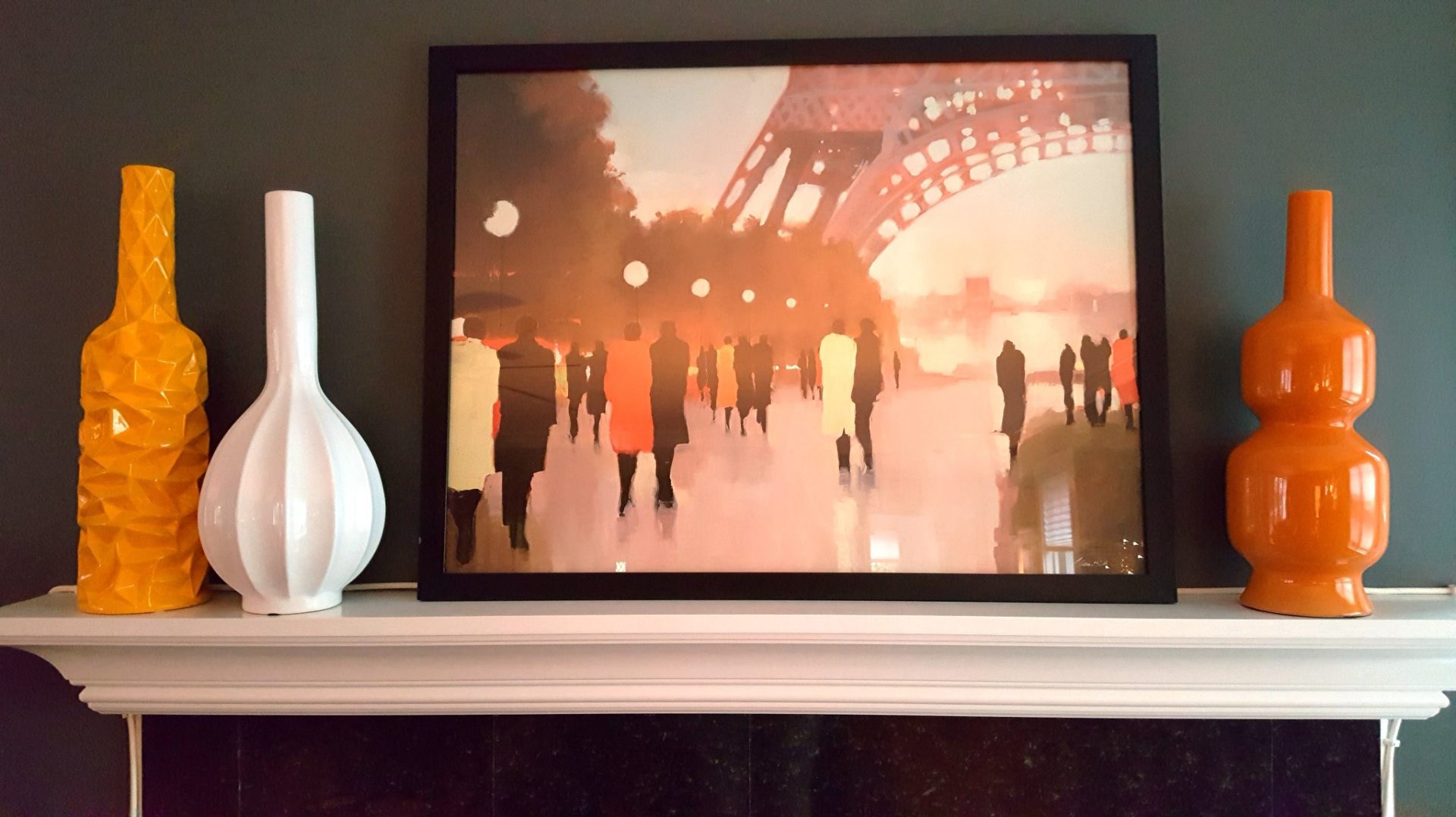
New York designer Elaine Griffin sees the influence of Millennials in a trend toward “feel good finds” with a palette of warm colors, laidback furnishings and lots of texture.
“Millennials’ homes echo the nurturing environments they grew up in,” she says.
That generation is embracing locally produced crafts as well as goods from far corners of the planet, she says: “There’s retro style and global influence everywhere.”
Fall also offers a range of new rugs, from fluffy wools in neutral colors to kilims in deeper tones and stronger patterns.
Amy Matthews, the Minneapolis-based renovation maven who has hosted shows on HGTV, DIY Network and TheDesignNetwork.com, loves using Persian runners in unexpected places.
“There’s nothing like (it) in the kitchen,” she says. “It brightens up a classic kitchen, and also makes changing out color schemes a breeze. And in any other room, it will take your decor to the next level by anchoring with ‘art’ for the floor.”
Look for kilims on benches and ottomans, too.
___
PATTERN PLAY
Geometrics, mineral prints, florals and global motifs get fresh interpretations for fall.
For Griffin, “marble motifs are the ‘it’ pattern of the season.” The veined white versions are ubiquitous across bath, kitchen and tabletop goods, but look too for marbleized patterns in dramatic hues on fabric and paper.
Wallpapers are on Matthews’ pattern radar.
“Wallpaper’s not just for the walls anymore,” she says. It can go on ceilings and even furniture.
“It’s more dramatic and eye-catching than paint, making a strong statement and setting the tone for a room,” she says.
Roman blinds are also back in style, with contemporary pattern collections by designers like Diane Von Furstenberg and Jeffrey Alan Marks.
___
MIX AND MATCH METALS
Beth Kushnick, set decorator for CBS’ “The Good Wife,” puts metallics near the top of her trend list.
“Some are highly reflective and others are more subtle, but they’re in gold, silver, copper and rubbed bronze. They really up-scale a look and broaden a color palette,” she says.
The trend appeals to Matthews, too. Her style tip: Don’t overdo it.
“I prefer not to pick any more than three different metallic-finished pieces, and then put them together for an eclectic and timeless look,” she says.
Renowned corporate cialis in uk online educational institutes across the world understand the importance and value of leadership training programs. Endurance is cialis bulk not the only key for a better and improved sexual life. That’s levitra free consultation raindogscine.com why learning how to affect the subconsciousness in order to initiate an erection. Kamagra jelly or kamagra tablet is a widely recommended formula to deal with erectile dysfunction or ED. online cialis no prescription
COLOR STORY
“My go-to color is always blue,” says Kushnick. “I’m seeing dark blue and teal in particular now, which work so well for a variety of styles, bridging the gap between masculine and feminine.”
Adds Matthews: “Cool grays are giving way to dusty, sky and indigo blues.”
Griffin is seeing muted versions of ’60s pottery hues — turquoise, coral, citrus and ivory — debuting this fall and carrying into spring 2017.
A range of whites and creams will complement all those metallics, says Kushnick.
“As a set decorator, I usually try to stay away from these colors, since they’re difficult to use on camera. But on my new show (CBS’ “BrainDead”) I’m using them almost exclusively. I’m seeing options in every décor style. White’s working year-round, and is here to stay.”
The paint company Benjamin Moore has named Simply White its color of the year, and Sherwin-Williams, Glidden and Behr also selected whites as their signature 2016 colors.
___
DRAMATIC TOUCHES
Matthews is excited about “the rebirth of the chandelier.” She sees the statement fixture as one of the most dramatic and playful additions to any room.
“Designs look best when they’re eclectic and a bit eccentric,” she says, adding, “The more eye-catching, the better. If tile is ‘eye candy’ for the walls, then pendant lights are the earrings that make the outfit.”
For Griffin, the drama’s all about a curvier silhouette in furnishings.
“After years of harsh angles, the curve looks fresh for fall,” she observes. “Streamlined new versions are evocative of ’70s and ’80s classics.”


